When Cathy blogged about the new website she complained that we didn’t have the awesomest height function for the heat mapping of our nodes in the graphs. Here are two graphs, one with the coloring as we currently use it on our site and one with Cathy’s choice.
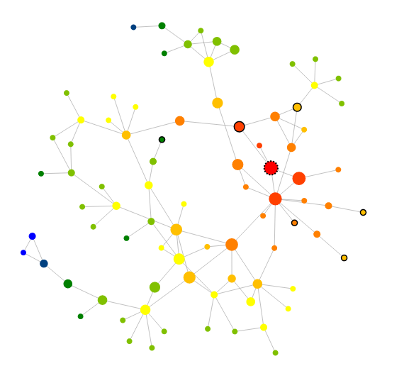
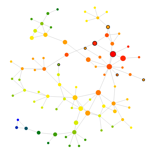
Questions: Can you figure out what the difference is? Which one do you like more?
PS: This isn’t completely fair because Cathy’s idea is that with her height function the coloring more accurately predicts the relevance of the results to the root note (the one with the wobbly outside). And with these static pictures you can’t see the meaning of the nodes (which you can if you visit the website).
The second one is obviously more beautiful and meaningful. Just sayin’.